
The 11 best E-commerce sites’ that give ideas and inspiration
You lack ideas and inspiration for your e-commerce site? Don’t panic. A quick look at the Awwwards should give your creativity and imagination a boost.
The Awwwards.com website is a platform designed to reward the most successful websites with the “Site Of The Day” (#SOTD) and “Site Of The Month ” (#SOTM) awards.
Awwward is therefore a kind of inventiveness hub, very practical for web workers who are sorely lacking in inspiration. The site also serves as a place of exchange where different web professionals share opinions, advice and experience.
By awarding the best websites, Awwward helps to discover, recognize and promote developers and agencies from all over the world who put all their talent and know-how into the websites they design. And this, whatever the technology used: WordPress, Magento, Prestashop, Joomla, etc.
Every day, agencies, service providers, web designers and developers can submit their creations for evaluation by Internet users and a multidisciplinary jury made up of experts from all walks of life: designers, bloggers and emerging agencies.
Sites are then rated on four distinct criteria:
- Design
- Creativity
- Usability
- Content
Among the winners, Alioze has selected 11 e-commerce sites that are full of ideas. Innovative design, graphic, ergonomic or conversational quality… if there is something for everyone, they all push the limits of creativity. So, ready to sail? Go.
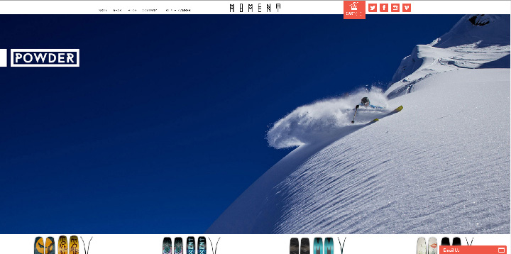
MOMENTSKIS.COM
Why start with this site? For the simple reason that it is the only e-commerce site to have received the “Site Of The Month” award. Although dated 2011, it has neither lost its charm nor its time. The slider on the home page takes the visitor directly into the world of powder snow. From the typography to the design, everything is worked in an atmosphere that reminds us of snow sports and the rejuvenating air of the mountains.
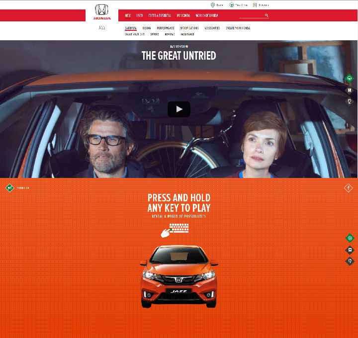
HONDA.CO.UK
More than an e-commerce site, this promotional site promotes the merits of the product through numerous videos showing the different performances of the Honda Jazz. The Internet user is involved thanks to a playful aspect: on the home page, each key pressed on the keyboard triggers a mini video in retro style.
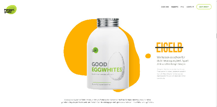
PUMPERLGSUND-BIO.DE
This site for “Good Eggwhites” – a bottled protein source – relies on a very clean design, in perfect correlation with the unique product it promotes. On arrival on the home page, the visitor scrolls to trigger different animations: paragraphs of text scroll like film credits and in a game of opacity until the discovery of the famous bottle which ends up turning on itself to show the visitor its composition.
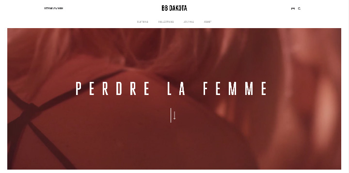
BBD.BASICAGENCYDEV.COM
Women are in the spotlight on the website of the ready-to-wear brand BB Dakota, for an immersive experience thanks to a rich video content that allows a vision of the clothes from every angle! The names of the collections, the online journal and the text content with its poetic and glamorous style are quite dreamy and add a narrative dimension to the navigation.
GITMAN.COM
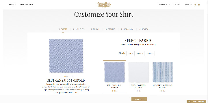
The website of Gitman Brothers, an American company that has specialized in the manufacture of shirts since the 1930s, does not just showcase its know-how and the different stages of production through immersive videos in the workshops. Indeed, e-commerce also allows you to design your own shirt, tie or trouser model, by choosing fabric, colour, size, length or even collar and sleeve style.
BUREAUTONIC.COM/EN
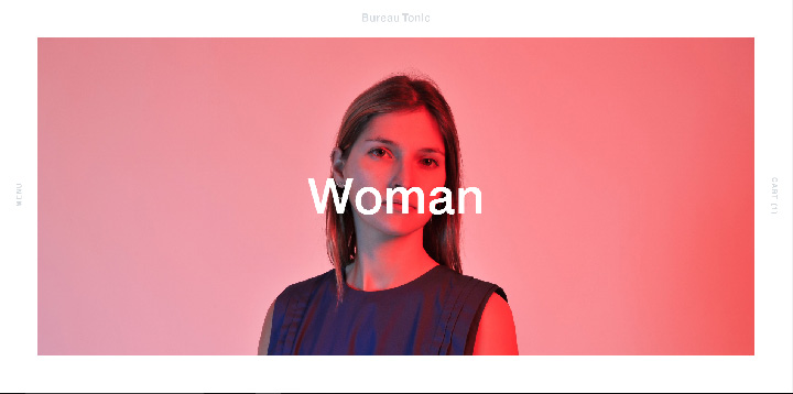
Bureau tonic relies on XXL images: a single block of images scrolls from the bottom to the top of the home page to lead to the different categories. The site is very minimalist, with very little text, and a very discreet menu. And it works!
BEOPLAY.COM
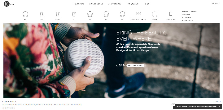
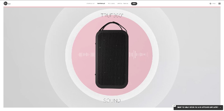
On its website, Beo Play makes full use of video to illustrate the freedom of movement that its products provide. With a pictorial menu, lively pages and animations imitating the movements of sound waves, the site is not lacking in creativity.
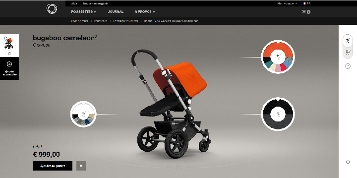
BUGABOO.COM
The Bugaboo mobility brand offers the possibility to design your own stroller and to visualize in real time the different color and material alternatives.
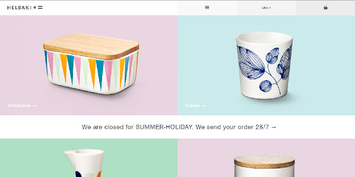
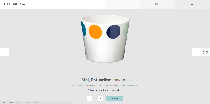
HELBAK.DK
Packshots produced on blocks with soft, pastel colours… and that’s it for Danish ceramist Malene Helbak! The design is clean and the quality of the visuals that showcase each product is on point.
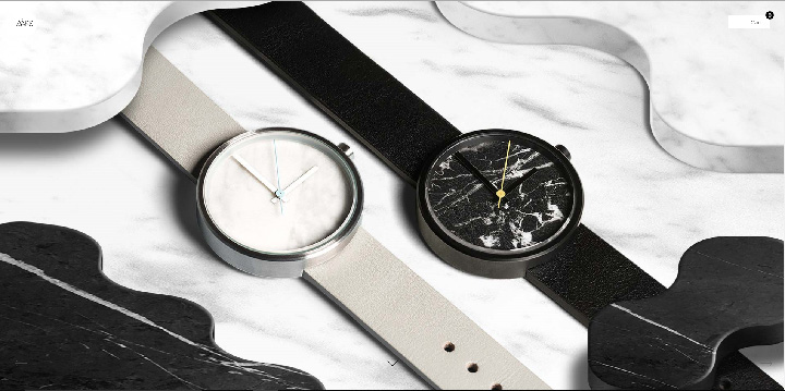
AARKCOLLECTIVE.COM
As soon as you arrive on the home page, the tone is set. The visitor is confronted with a full screen image that immediately immerses him in the space-time of the watches. Even before the user starts browsing, the experience is aesthetically pleasing thanks to the attractive presentation of the products and their components, playing on symmetry, geometry, textures and bright colours. On Aaark Collective’s website, time doesn’t pass.
BAGIGIA.COM
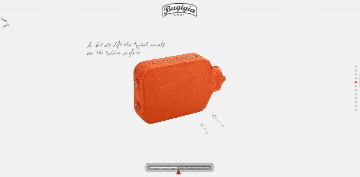
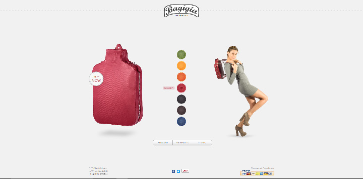
Bagigia’s e-commerce offers a playful navigation to the visitor who is invited to advance in his navigation thanks to a closure! The more “open” the latter is, the more access the user has to the product and its features. The animations to discover the different colours of the product are just as successful and original.






Leave a Reply
You must be logged in to post a comment.